Summary
In today’s saturated digital landscape, where attention spans are shorter than ever, iconography has become more than a design accessory; it’s a strategic branding tool. For CMOs and brand leaders, iconography isn’t just about creating visually pleasing symbols; it’s about crafting a recognizable, scalable, and universal visual language that drives consistency and trust across platforms. This article explores how enterprise brands leverage iconography to strengthen brand identity, streamline communication, and achieve global resonance.
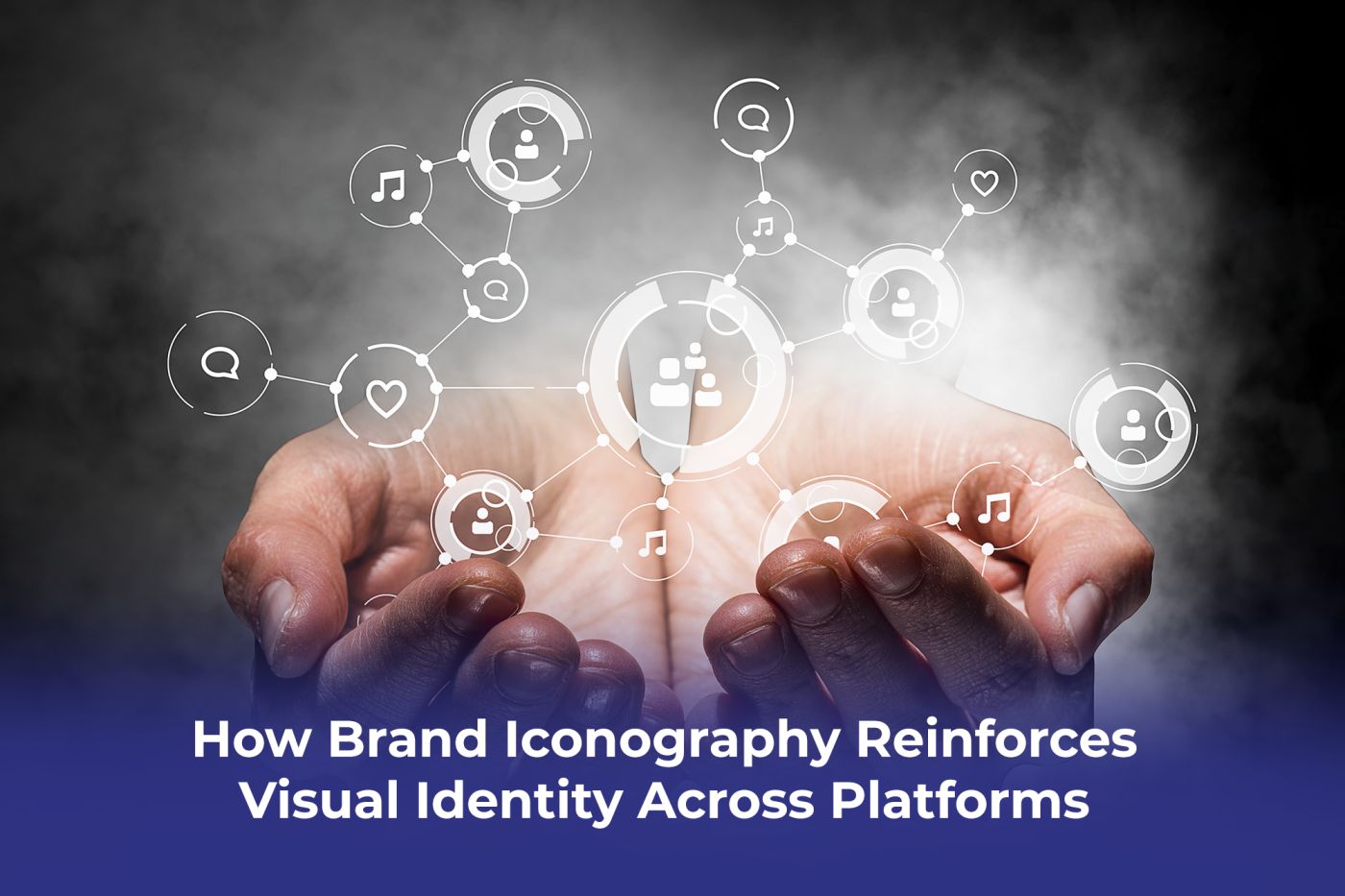
What Is Iconography in Brand Design?
At its core, iconography is the use of simplified visuals or symbols to communicate complex concepts quickly and effectively. Unlike logos or standalone graphics, iconography extends into every touchpoint, including websites, apps, packaging, presentations, and signage.
For enterprise-scale companies, iconography serves as a bridge between design and strategy, ensuring that visual cues align with brand identity while delivering clarity for diverse audiences.
Why Iconography Matters for Modern Brands
1. Consistency Across Platforms
A strong set of icons ensures visual cohesion across websites, mobile apps, marketing campaigns, and physical collateral. Consistency builds trust, signaling professionalism and reliability.
2. Global Communication Without Barriers
In multinational markets, text often needs translation, but well-designed icons transcend language, reducing friction and improving accessibility.
3. Enhancing User Experience (UX)
Icons help simplify navigation in digital interfaces. They improve usability, guide customer journeys, and reduce cognitive load, all essential for enterprise-level websites and applications.
4. Supporting Brand Recognition
When executed strategically, custom iconography becomes an extension of the brand identity, reinforcing color palettes, visual styles, and tone of voice.
Strategic Benefits for CMOs and Brand Leaders
- Scalability: Icon systems can be adapted across campaigns without diluting brand equity.
- Clarity in Data Visualization: Icons simplify complex reports and presentations, helping leadership teams communicate insights more effectively.
- Alignment with Brand Storytelling: Icons serve as micro-narratives, turning abstract concepts into tangible, relatable visuals.
Best Practices for Building an Iconography System
1. Start with Brand Guidelines
Ensure icons are designed to complement existing typography, colors, and visual elements.
2. Prioritize Simplicity
Icons should be instantly recognizable and not overloaded with details.
3. Design for Scalability
Icons must remain clear across digital, print, and environmental design.
4. Test Across Cultural Contexts
An icon that works in one market may be confusing in another. Testing ensures inclusivity and clarity.
Common Mistakes to Avoid
- Using stock icons that dilute uniqueness.
- Overcomplicating design with unnecessary details.
- Inconsistency across different platforms and campaigns.
FAQs About Iconography in Brand Design
Q1: How is iconography different from a logo?
A logo is a single brand identifier, while iconography is a system of visual cues used across multiple touchpoints.
Q2: Can iconography impact brand perception?
Yes. Consistent, well-designed icons reinforce professionalism, accessibility, and innovation, key traits for modern enterprises.
Q3: Should CMOs invest in custom iconography?
Absolutely. Custom iconography elevates brand distinctiveness and avoids the generic feel of stock visuals.
Final Thoughts
In 2025, iconography is no longer optional; it’s a cornerstone of modern brand design. For CMOs and brand leaders, investing in a strategic icon system enhances recognition, simplifies communication, and ensures brand cohesion across platforms.
At Proton Effect, we help enterprises transform abstract strategies into impactful design systems. Explore our Motion Graphics & Multimedia service to see how we create scalable, future-ready iconography that enhances brand communication.