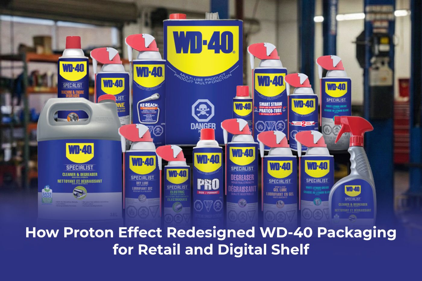
When Proton Effect redesigned WD-40 packaging, we understood from the first brief that this was not a standard creative project. WD-40 is one of the most recognized household product brands in the world. More than 2 billion users use the product across 176 countries. The blue and yellow packaging sits on shelves in hardware stores, auto shops, and general retailers across every continent. Touching that visual identity means working with decades of accumulated brand trust, and every decision carries the weight of what the brand has built over its entire history.
The challenge was not just to make the packaging look better. The challenge was to make it work harder, across two fundamentally different commercial environments, without losing a single ounce of the recognition that makes WD-40 instantly identifiable to buyers everywhere.
This case study covers how we approached the WD-40 packaging redesign, the strategic principles that guided the work, and what other FMCG brands and consumer goods companies can learn from a process that balances heritage with commercial performance.
Key Takeaways
- Proton Effect redesigned WD-40 packaging to serve both physical retail shelf and digital commerce environments simultaneously.
- Packaging for established brands requires protecting visual equity while updating design for modern retail and e-commerce performance standards.
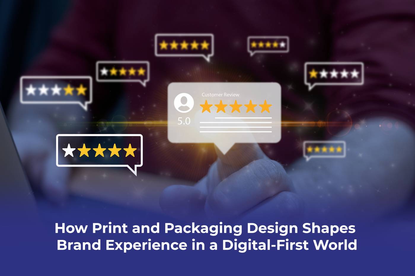
- Consumer goods packaging now serves two audiences: the retail buyer who evaluates it at three feet and the online shopper who sees it at 200 pixels on a mobile screen.
- The WD-40 Smart Straw product line required a separate packaging narrative to communicate its functional innovation while maintaining brand-family coherence.
- FMCG brands considering a packaging redesign should engage a partner with experience across physical and digital shelf formats, not just one or the other.
The Challenge of Redesigning an Iconic Consumer Brand
Not every packaging project carries the same level of strategic risk. For a new product launch, the design team starts with a clean brief and builds equity from scratch. For an established brand with global retail distribution and decades of visual consistency, the equation is completely different.
WD-40 falls into the category of brands whose packaging has become part of the product identity. Buyers recognize the iconic blue and yellow at a glance. Retailers stock it based on established sell-through data. Global distributors handle it based on packaging standards that have stayed consistent for years. Any redesign has to account for all of this before a single concept gets developed.
Heritage vs Evolution
The fundamental tension in any established brand packaging redesign is the conflict between protection and progress. Protect too much, and the redesign delivers nothing of commercial value. Push too far, and the brand loses the visual recognition that drives repeat purchases.
The brands that navigate this tension best approach it as a strategic question before they approach it as a creative one. What visual elements carry genuine recognition value and must stay intact? What elements are simply familiar without being functionally necessary? What does the packaging need to communicate in 2025 that it did not need to communicate in 2010?
Answering those questions requires consumer research, competitive shelf analysis, and a clear brief that separates brand equity elements from dated design conventions. We started the WD-40 packaging redesign engagement with exactly that foundation, and every creative decision that followed referenced it.
The Dual Channel Problem
Physical retail packaging and digital commerce packaging operate by entirely different rules. At the retail shelf, a buyer sees the product at roughly three to five feet. The packaging has a fraction of a second to interrupt the visual scan, communicate the brand, and signal the product type before the buyer moves on or picks it up.
On Amazon, that same product appears as a thumbnail in a search results grid on a mobile screen. The viewing distance is inches. The format is roughly 200 by 200 pixels. The packaging graphic that reads beautifully at retail scale often collapses into visual noise at that resolution.
Research consistently shows that more than 60 percent of Amazon purchases happen on mobile devices. For an established consumer goods brand with a growing ecommerce channel, this is not a minor consideration. It is a strategic design constraint that has to sit alongside physical shelf performance from the very beginning of the redesign process.
What the Redesigned WD-40 Packaging Needed to Achieve
Before any design work began, we established the performance criteria the new packaging needed to meet. This is the stage where strategic investment happens and where most packaging projects either succeed or fail before a single concept reaches the screen.
Strong packaging design for a brand with WD-40’s market position needs to do the following simultaneously.
Retail Shelf Performance
At the physical retail level, the new packaging needed to maintain instant brand recognition across every format in the product range. WD-40 products sit in different retail environments: hardware stores, automotive sections, industrial supply retailers, and general merchandise stores. Each environment has different shelf architecture, different competing products, and different buyer behavior patterns.
The packaging needed to create a coherent visual family across the full product range while allowing each product variant to communicate its specific function clearly. A buyer in an auto shop who needs the original formula should never confuse it with the Smart Straw variant or any other line extension. Visual family coherence and individual product clarity must coexist in the same design system.
Digital Shelf Performance
The digital shelf requirements applied a completely different set of constraints. On Amazon and other e-commerce platforms, the hero image is the first and often only visual the shopper sees before making a click decision.
Hero image performance requires bold visual hierarchy, strong contrast, and the elimination of any packaging detail that becomes illegible at small screen sizes. The WD-40 brand mark, color blocking, and product identification all needed to be read clearly at the mobile thumbnail scale. The secondary images and A-plus content then carry the storytelling work that physical packaging does in the aisle.
We designed the packaging update with both environments in mind from the start, which meant the retail version and the digital shelf presentation shared a visual language rather than requiring separate adaptations after the fact.
How We Approached the WD-40 Packaging Redesign
The strategic approach we bring to a consumer goods packaging redesign of this scale follows a structured sequence that starts with research and ends with production-ready files and digital asset delivery.
Brand Equity Audit Before Design Development
Before developing any concepts, the team conducted a detailed audit of the existing WD-40 packaging system. This covers which visual elements carry the strongest recognition signals, how the packaging performs against competitor products across key retail channels, and where the existing design creates friction for buyers in digital commerce contexts.
The audit provided a clear brief that distinguished between elements that needed to stay protected and elements that could evolve. That distinction does not come from instinct or aesthetic preference. It comes from a structured analysis of what the brand actually owns in the mind of the buyer, and that analysis is the foundation of every design decision that follows.
The Smart Straw Product Line
The WD-40 Smart Straw product presented a specific packaging challenge within the broader WD-40 packaging redesign. The Smart Straw is a functional innovation: a straw delivery system integrated directly into the can that switches between a stream and a spray without a separate straw to lose. This is a meaningful product benefit, and the packaging needs to communicate it clearly to buyers who may not be familiar with the variant.
The challenge is communicating that functional differentiation while keeping the packaging visually connected to the WD-40 brand family. A buyer who reaches for WD-40 Smart Straw needs to feel confident they are buying a genuine WD-40 product, not a third-party alternative. The visual family coherence must be clear, even as the product-specific communication adds a layer of detail that the standard product does not carry.
Proton Effect developed the Smart Straw packaging narrative to address both requirements: maintaining unmistakable WD-40 brand recognition while giving the functional innovation the visual prominence it needs to justify the purchase decision for a buyer choosing between the standard and Smart Straw variants.
To explore the full scope of this engagement, visit the WD-40 Smart Straw case study on the Proton Effect website.
What FMCG Brands Can Learn from the WD-40 Packaging Redesign
Every consumer goods brand faces a version of the same challenge at some point in its history: the packaging that earned recognition in one era of retail needs to perform in a commercial environment that has changed significantly. The FMCG packaging design lessons from the WD-40 engagement apply to any established brand navigating the same crossroads.
Signals That a Consumer Goods Packaging Redesign Is Due
Most established brands wait too long to initiate a packaging redesign. These are the signals that indicate that the investment has become necessary rather than optional.
- The packaging does not perform consistently across physical retail and digital shelf formats
- Shelf pickup rates have declined despite stable pricing and distribution
- The brand family lacks visual coherence across line extensions and product variants
- Digital commerce hero images score below the category average on click-through rate
- Retailer buyers have flagged the packaging as below current category standards
- A significant competitor has launched updated packaging that outperforms at the retail shelf
Any one of these signals warrants a serious packaging audit. Multiple signals appearing simultaneously indicate the redesign has already moved from strategic to urgent.
Building a Brief That Protects Brand Equity
The most common mistake in consumer goods packaging redesigns is starting with aesthetic ambition rather than strategic clarity. The brief that guides a redesign for an established brand needs to answer specific questions before any design work begins.
Which visual elements carry genuine consumer recognition and must be treated as non-negotiable brand equities? Which elements are habitual rather than functional and can evolve without affecting recognition? What new commercial requirements does the packaging need to address that the existing design does not accommodate? What does success look like at retail, on Amazon, and in trade marketing materials?
A brief that answers these questions gives the design team the direction they need to make confident decisions without constantly seeking approval for individual choices. It also gives the client a framework for evaluating creative concepts against commercial criteria rather than personal preference, which consistently produces better work and faster approval cycles.
How Proton Effect Helps Consumer Brands Redesign Packaging
Proton Effect approaches consumer goods packaging design as a commercial discipline, not a creative exercise. Every packaging engagement we take on starts with the strategic question of what the packaging needs to achieve commercially before we ask what it should look like creatively.
Our experience covers the full range of consumer goods categories where established brands face packaging redesign decisions. From household maintenance products to FMCG brands to industrial consumer goods, we bring the same structured approach to each engagement: brand equity audit, strategic brief, dual channel design development, and production management through to final delivery.
For brands selling on Amazon, we extend the packaging engagement to include hero image optimization and A-plus content design that connects the physical packaging identity to the digital shelf presentation. This dual-channel approach reflects how modern FMCG packaging design actually works for any brand with a meaningful ecommerce presence alongside its retail distribution.
For brands considering a product packaging redesign, the most important first step is an honest audit of where the current packaging underperforms and what commercial objectives the redesign needs to address. We offer that audit as the entry point for any new packaging engagement.
Ready to talk about your packaging? Contact Proton Effect | Visit the Packaging Design Service Page
The redesigned WD-40 packaging represents what becomes possible when brand heritage and modern design thinking work together rather than against each other. The visual recognition that WD-40 has built over its entire history stays intact. The packaging now performs with equal strength at the retail shelf and on the digital shelf, across every market where the product competes.
For FMCG brands and consumer goods companies considering a packaging redesign, the WD-40 engagement illustrates the process Proton Effect brings to every project of this kind: strategic foundation first, creative development second, and a consistent commitment to packaging that earns its place in the commercial environment it needs to perform in, not just the one it was originally designed for.
See more of our packaging work. Contact Proton Effect | Visit the Packaging Design Service Page
Frequently Asked Questions
1. What does a consumer goods packaging redesign involve?
A consumer goods packaging redesign covers the strategic and creative process of updating a brand’s physical packaging to improve performance across commercial environments. The scope typically includes a brand equity audit to identify which visual elements carry genuine recognition value, a strategic brief that defines performance criteria for both physical retail and digital shelf, creative concept development and refinement, production-ready file delivery, and, in many cases, digital shelf adaptation for e-commerce platforms, including Amazon. For established brands, the process places as much emphasis on what to protect as on what to change, because mismanaging brand equity is a more common and costly failure than not updating the design at all.
2. How do you balance brand heritage with modern packaging design?
Balancing brand heritage with modern packaging design starts with separating what a brand actually owns in the mind of the buyer from what is simply familiar through long repetition. Some visual elements, including distinctive color combinations, brand marks, and structural formats, carry genuine recognition that influences purchase decisions. Others are conventional without being functionally necessary. A structured brand equity audit identifies which elements fall into which category. The design brief then treats the genuine equities as non-negotiable anchors while giving the creative team latitude to evolve the elements that do not carry recognition weight. This approach produces packaging that feels both recognizable and fresh without creating the buyer confusion that comes from redesigns that change too much at once.
3. What is the difference between retail shelf packaging and digital shelf packaging?
Retail shelf packaging performs at a viewing distance of roughly three to five feet, where a buyer scans a fixture of competing products in seconds. The design needs to interrupt that scan, communicate the brand immediately, and signal the product type before the buyer’s eye moves on. Digital shelf packaging performs on a mobile screen at a much smaller scale, where the hero image appears at roughly 200 by 200 pixels in a search results grid. At that scale, the detail that reads beautifully at retail becomes visual noise. Bold color blocking, strong contrast, and simplified graphic hierarchy perform better in digital contexts than the layered detail that works on a physical shelf. The strongest consumer goods packaging design serves both environments from a single visual system rather than requiring separate adaptations.
4. How does Proton Effect approach packaging redesigns for established brands?
Proton Effect approaches established brand packaging redesigns by starting with a structured brand equity audit rather than jumping straight to design development. The audit identifies which visual elements carry genuine consumer recognition, how the existing packaging performs against competitors in key retail channels, and where the design creates friction in digital commerce contexts. This analysis produces a strategic brief that clearly defines what must stay protected and what can evolve. Creative development then proceeds within that brief, which means every design decision references a commercial criterion rather than aesthetic preference. This approach produces faster approval cycles and more confident creative decisions because both the agency and the client share a common framework for evaluating the work.
5. Does Proton Effect design packaging for both retail and Amazon?
Yes. Proton Effect designs consumer goods packaging for both physical retail and digital commerce environments, and we treat both as connected requirements within the same engagement rather than separate projects. For brands selling on Amazon, we extend the packaging engagement to include hero image optimization, secondary image sequence design, and A-plus content development that connects the physical packaging identity to the digital shelf presentation. This dual-channel approach reflects how modern consumer goods brands reach buyers, where a product might be purchased in a hardware store or through an Amazon search on a mobile phone within the same week. The packaging needs to be performed with equal strength in both contexts.
6. What types of consumer goods brands does Proton Effect work with?
Proton Effect works with established consumer goods brands across a range of categories outside the food and beverage sector that most packaging agencies specialize in. Our clients include household maintenance and industrial products brands, FMCG companies with global retail distribution, and consumer goods businesses with complex multi-market packaging requirements. We have delivered packaging work for brands including WD-40, a globally recognized household product brand sold in more than 176 countries, as well as FMCG brands operating across the USA, UAE, and Pakistan. Our focus on physical product companies with real retail distribution and ecommerce presence distinguishes our packaging practice from agencies that work primarily with food, beverage, and beauty brands.